
Homepage Options v3.0
Cover Options
Cover Toggle
Enable or disable the cover section.
If disabled, all options in the Cover section will have no effect. (Default: enabled)
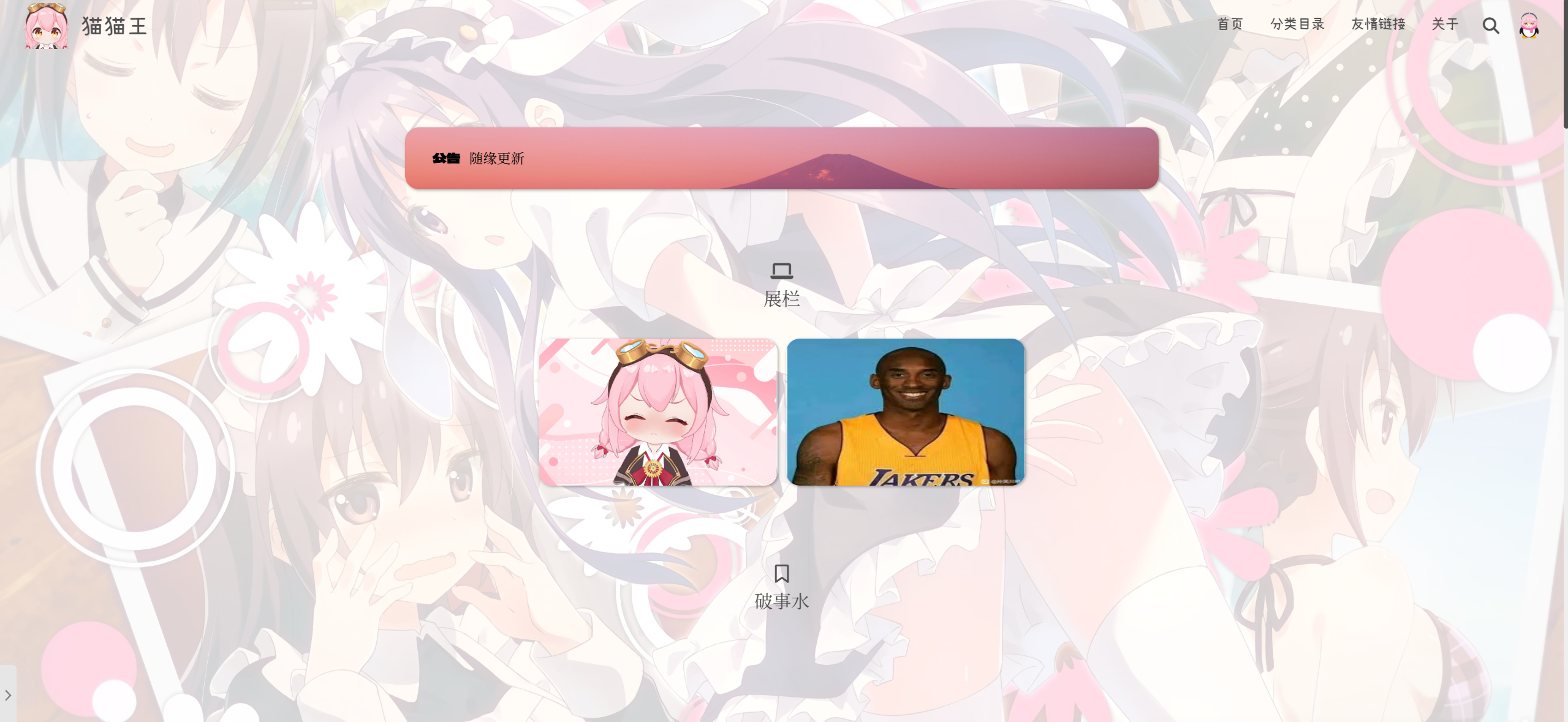
Disabled: only the showcase/posts area is shown.
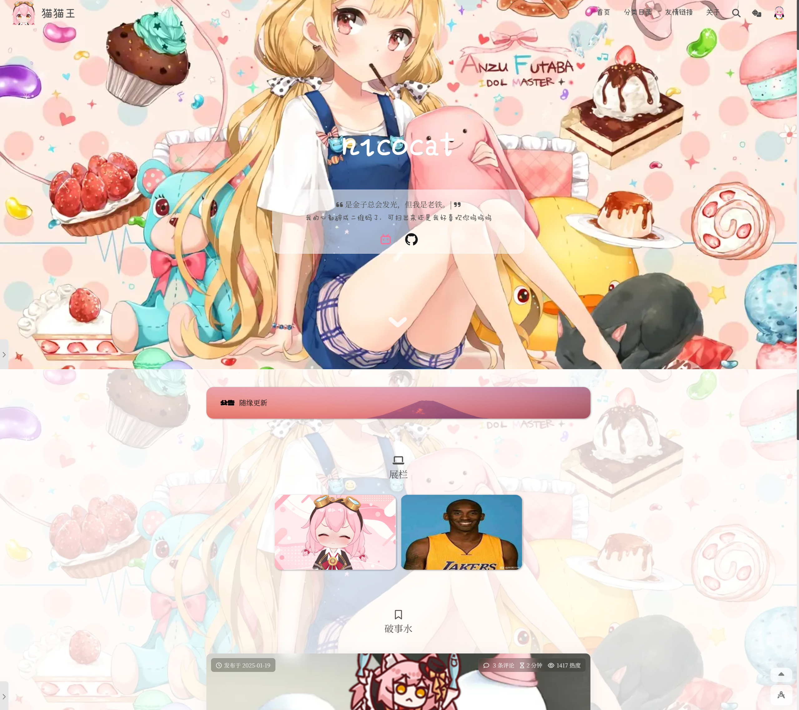
Enabled: cover, showcase, and posts areas are all displayed.
Fullscreen Cover
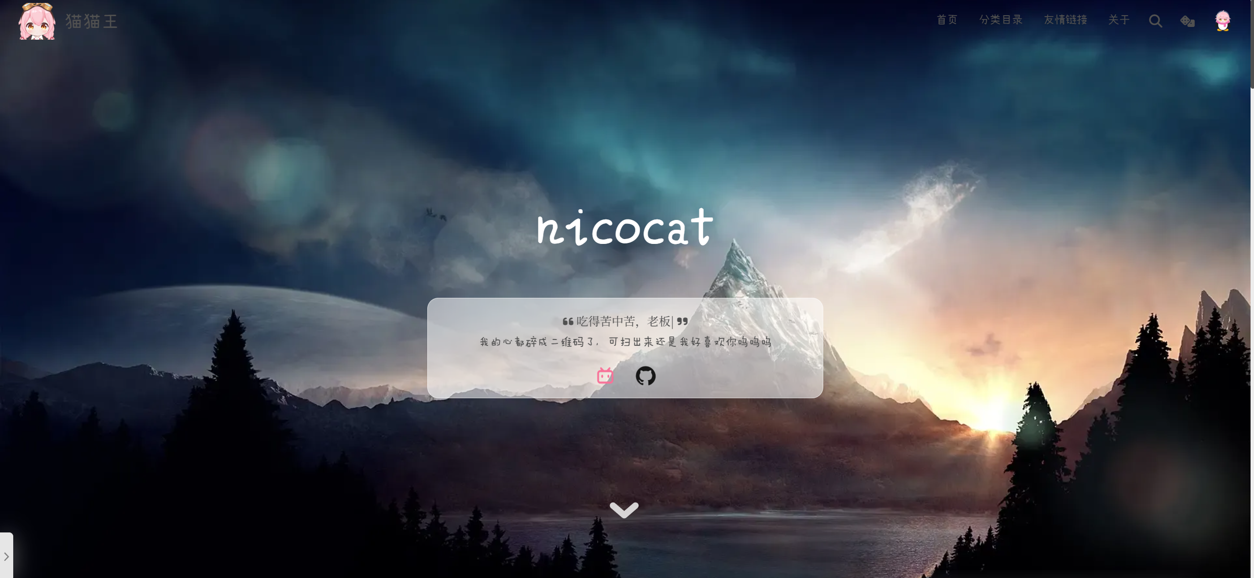
Toggle whether the cover spans the full screen. (Default: enabled)
If disabled, the cover will not fill the entire viewport.
Fullscreen Off
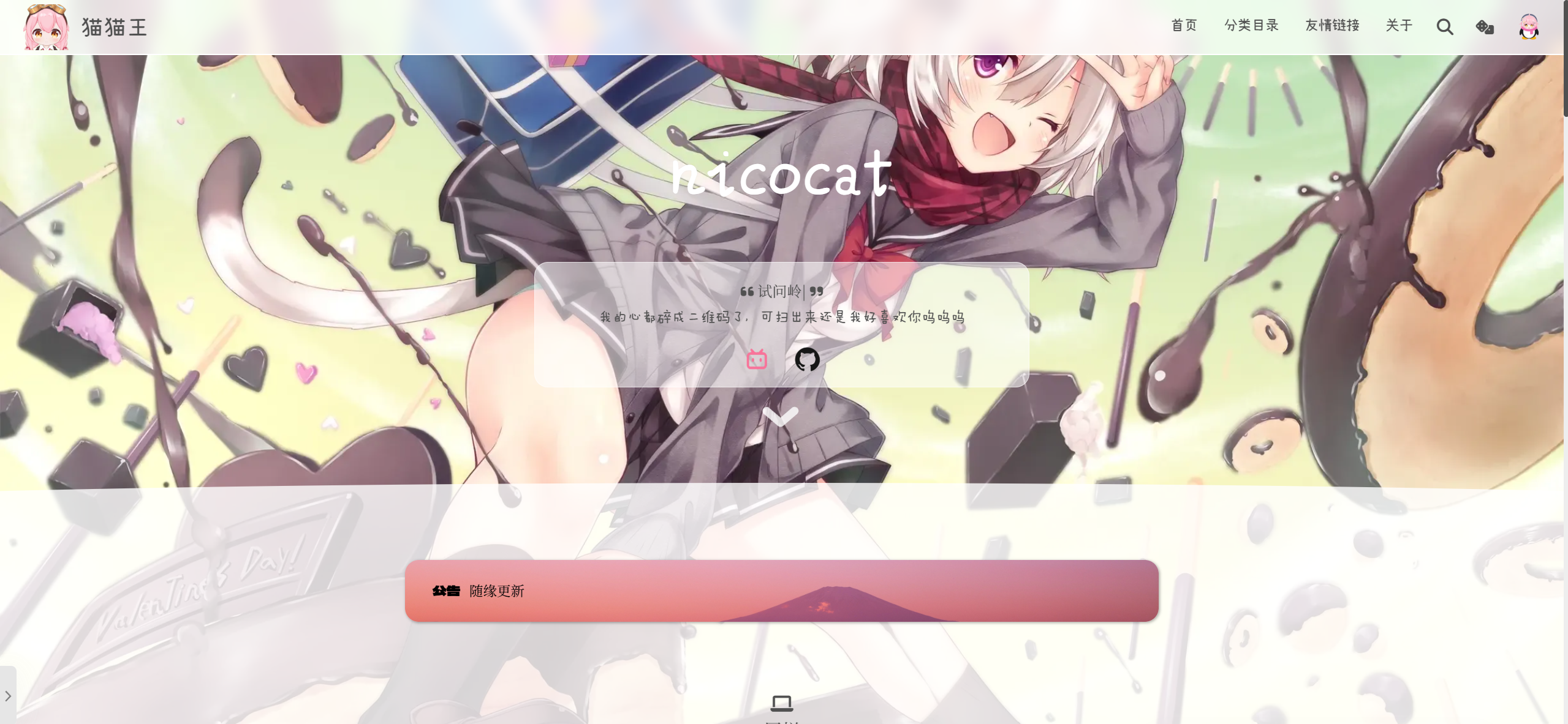
Fullscreen On
Curved Cover Mask
Apply an arc-shaped mask to the bottom of the cover.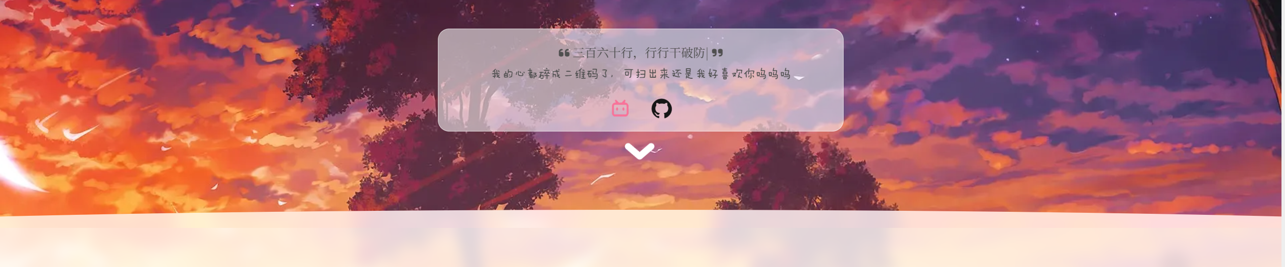
Cover Animation
Set the duration of the cover transition animation.
Drag the slider; recommended range: 1–2 seconds.
Animation On
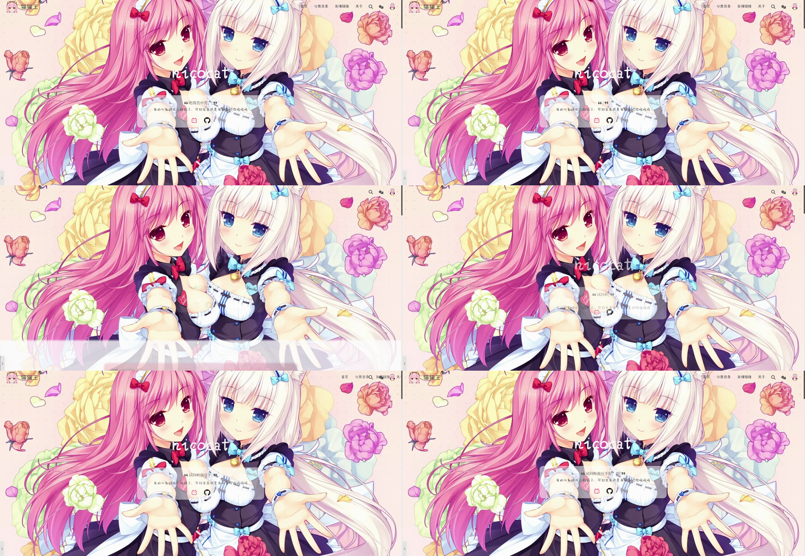
Animation Off

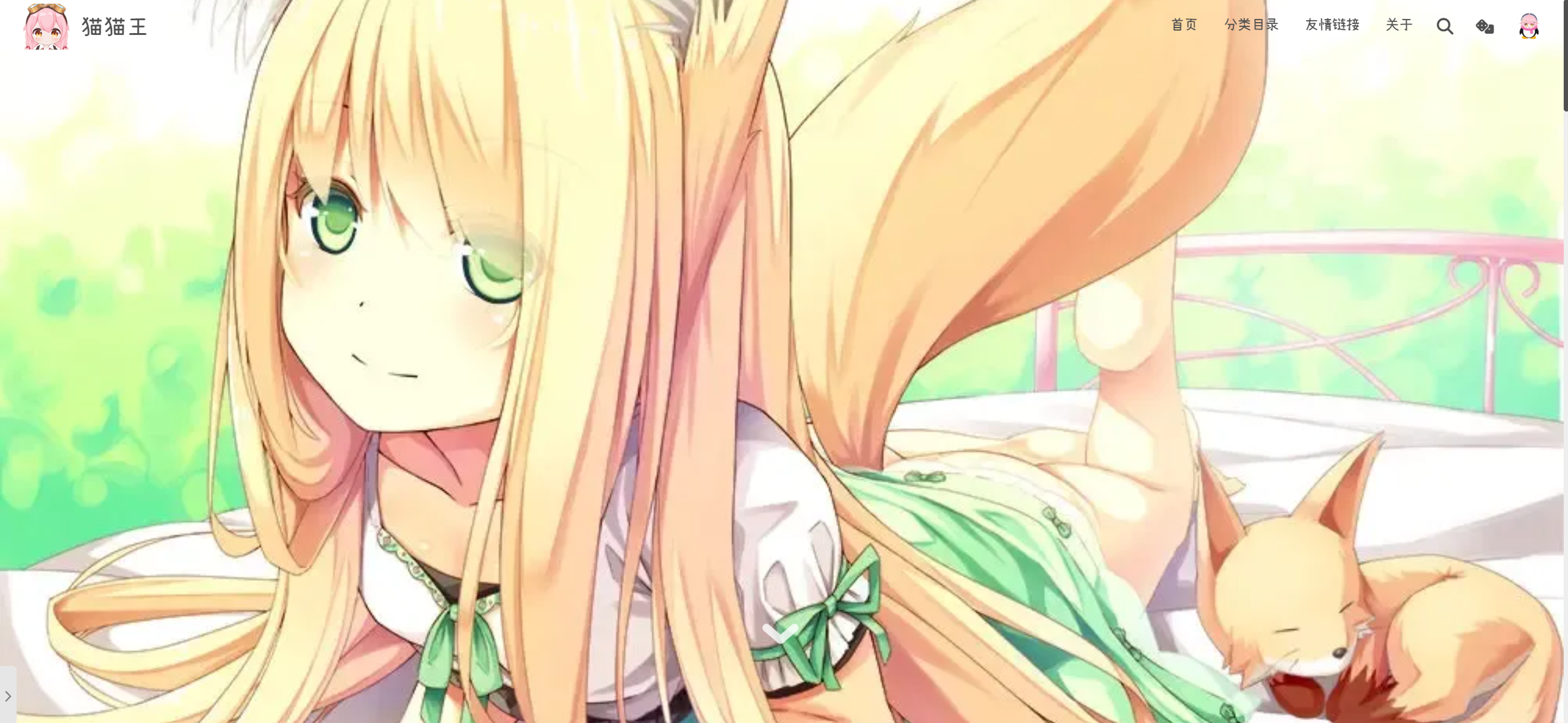
Cover Info Bar
Toggle the display of avatar, slogan text, signature, and social icons on the cover. (Default: enabled)
If disabled, only the cover image shows.
Info Bar Style
Choose layout for the cover info bar:
Separated

Merged

Info Bar Background Opacity
Adjust the transparency of the info bar background.
Avatar Border Radius
Set the corner radius of the cover avatar.
Drag the slider; recommended: 100 (fully round).
Radius = 0
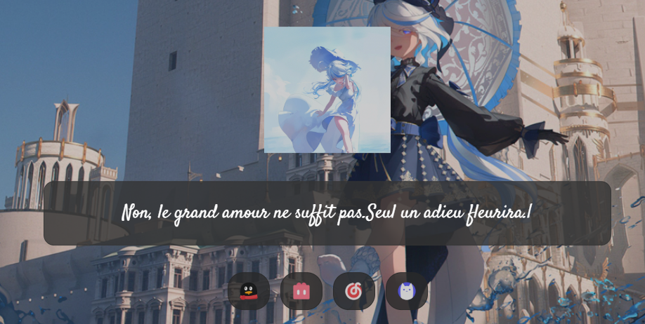
Radius = 100
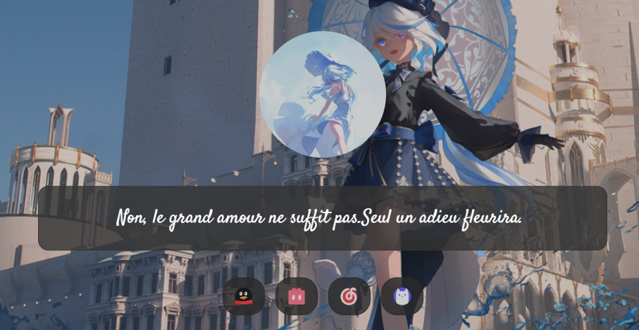
Signature Text
Enter the text for your cover signature line.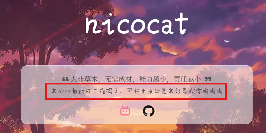
Signature Font
Specify the font name for the signature text.
Example:
Ma Shan Zheng
Signature Font Size
Set the font size for the signature text.
Drag the slider; recommended: 15–18px.
Typed-Text Effect for Signature
Enable the built-in typing animation for your signature.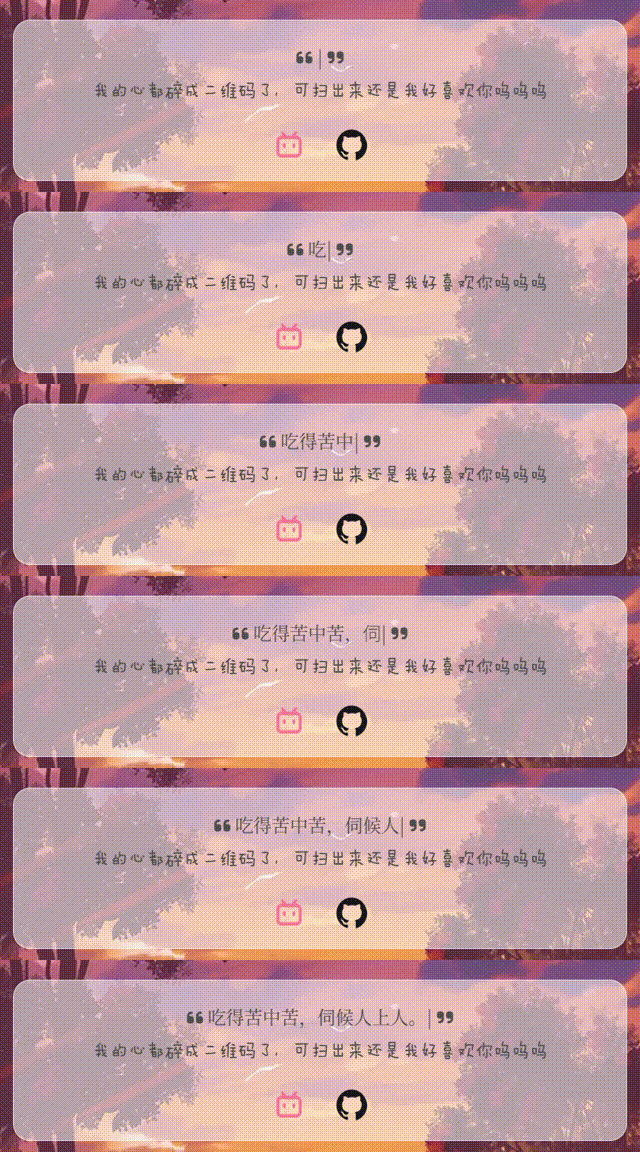
- Add Quotes: wrap the typed text in quotation marks.
- Placeholder: text shown before typing begins.
- Typed.js Options: customize the typing effect parameters.
Cover “Shuoshuo” Section
When enabled, your latest “shuoshuo” (short status) and your signature will alternate on the cover.
Random Image Options
By default the theme uses external random image APIs. To use your local library, switch to Built-in API. See Built-in Random Image API for details.
External API URL: enter an external random-image endpoint.
Examples:Separate API by Device: use different APIs for desktop vs. mobile.
Mobile API URL: endpoint for mobile images.
Examples:
Cover Image Cache
Enable local caching of the first random cover image to speed up initial load. (Default: on)
WARNING
Requires the cover API to support CORS.
Unified Cover & Background
When enabled, the cover becomes transparent and the frontend background uses the same random-API images.
Featured-Image as Background
If a post has a featured image and no widget override is active, that image will be used as the homepage background. Returning home resets the background.
Cover Image Filters
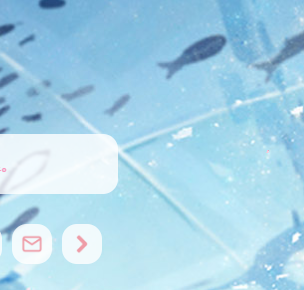 None (default)
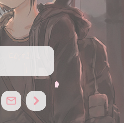 Light
Light Dim
Dim Grid
Grid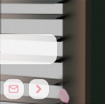 Dots
Dots
Cover Wave Effect
Enable the built-in wave animation on the cover. (Default: off)
WARNING
Hidden in dark mode by default.
Pull-Down Arrow
Show a down-arrow button on the cover to scroll to content.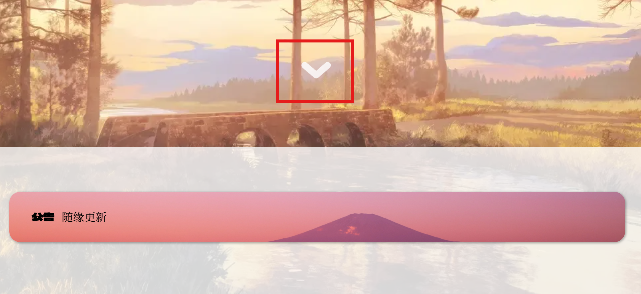
- Mobile Display: toggle whether the arrow appears on mobile.
- Arrow Color: pick a light color for light mode.
- Dark Mode Arrow Color: pick a darker color for dark mode.
Cover Video Options
Toggle a video background on the cover.
- Loop Video (requires PJAX).
- Resume on Return (requires PJAX).
- Base URL: the folder path for your video files (no trailing slash; use
./for root). - File Names: comma-separated list (e.g.
intro,loop). Default: random.
WARNING
Since v2.2.1.1, the URL must end with / and file names must include the .mp4 extension.
TIP
Videos do not autoplay; a play button appears in the lower-right corner of the cover.
Social Icons on Cover
Social Section Toggle
Show or hide the cover’s social icons and the random-image dice button.
Icon Style
Choose from three icon sets:
Social Section Radius
Set the corner radius of the social-icons container.
Drag slider; recommended 10–20.
Radius = 0

Radius = 30

Dice Button Toggle
Show the random-cover-image toggle (dice icon).
Social Links
Enter URLs for your profiles. To find them, copy your browser’s address bar while viewing your public page. Supported networks:
WeChat, QQ, Bilibili, NetEase Cloud Music, Weibo, GitHub, Telegram, Steam, YouTube, Instagram, TikTok, Xiaohongshu, Discord, Zhihu, LinkedIn, Twitter, Facebook, Email (user & domain), or a custom icon+URL.
Homepage Layout
Layout Order
Drag to reorder which sections appear on the homepage. Only sections you add here will display (default: Posts only).
Section Icons & Titles
Showcase Section
- Icon: choose a FontAwesome icon (default:
fa-solid fa-laptop) from FontAwesome. - Title: default “Display”.
Posts Section
- Icon: default
fa-regular fa-bookmark. - Title: default “Article”.
Title Font
Specify a font name (e.g. Ma Shan Zheng).
Title Alignment
Choose left, center, or right alignment.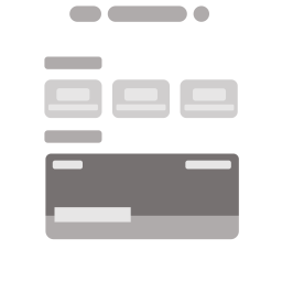 Left
Left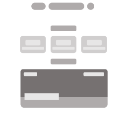 Center
 Right
Right
Display Area Options
Capsule Components
Add capsule components in the selection box and drag to arrange their display order. They will appear in the display area as arranged.
Display Badge Capsules
When enabled, bronze/silver/gold badges will be displayed for milestones.
When site operation days, post views, friend links count, or word count reach targets, relevant capsules will be replaced with medal displays.
Items
Define each showcase item with:
- Image URL
- Title
- Description (omit if using Bottom-to-Top style)
- Link URL
Add or remove items using the + or x buttons.
Posts Section Options
Info Elements
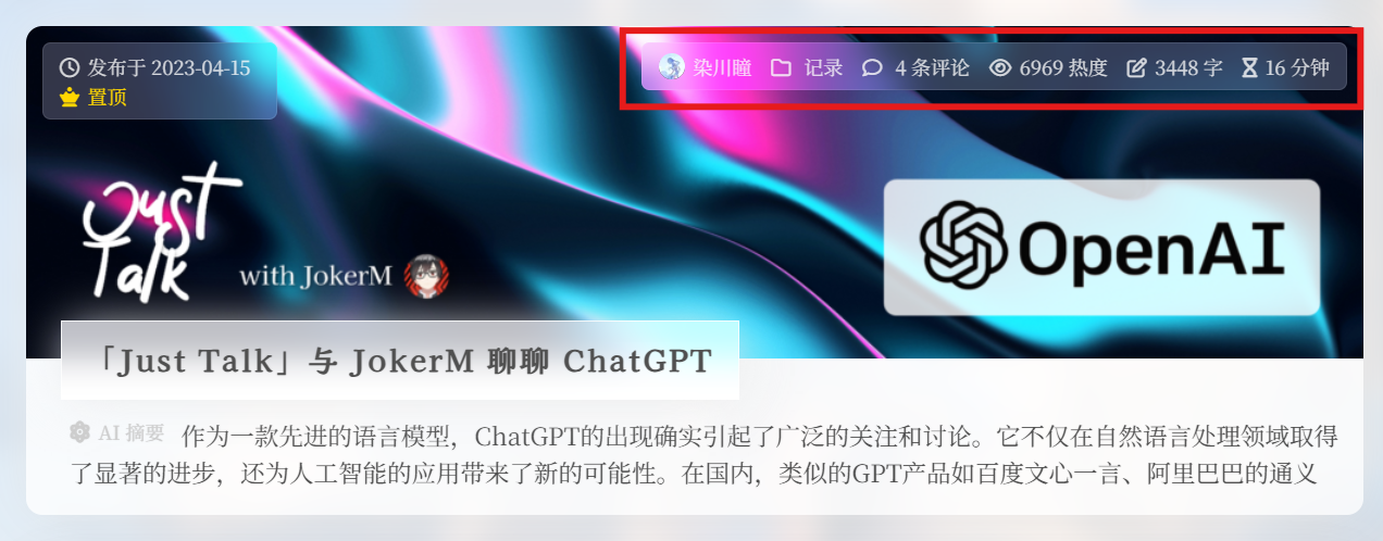
Toggle metadata badges (e.g. date, category) shown on post cards.
Layout Style
Image + Text (default)
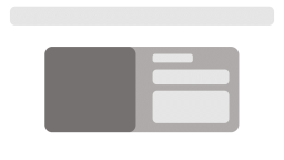
- Image Alignment: Alternate (default), Left, or Right.
 Alternate
 Left
Left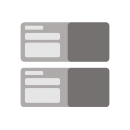 Right
Right
- Image Alignment: Alternate (default), Left, or Right.
Standard

- Image Shape: Circle (default) or Square.
 Circle
 Square
- Image Shape: Circle (default) or Square.
Icon Color
Set the color for any icons on post cards.
Card Shadow Color
Choose a subtle shadow color to add depth.
Decorative Images on Cards
- Cover Random Image (follows cover API)
- External API: enter a custom endpoint for card images.
TIP
To set a unique image per post, edit its Featured Image in the post editor.
Tutorial: Setting Post Featured Image
Card Corner Radius
Adjust the corner radius of post cards.
Info Readability Overlay
Enable a dark overlay behind text to improve contrast.
Info & Title Radius
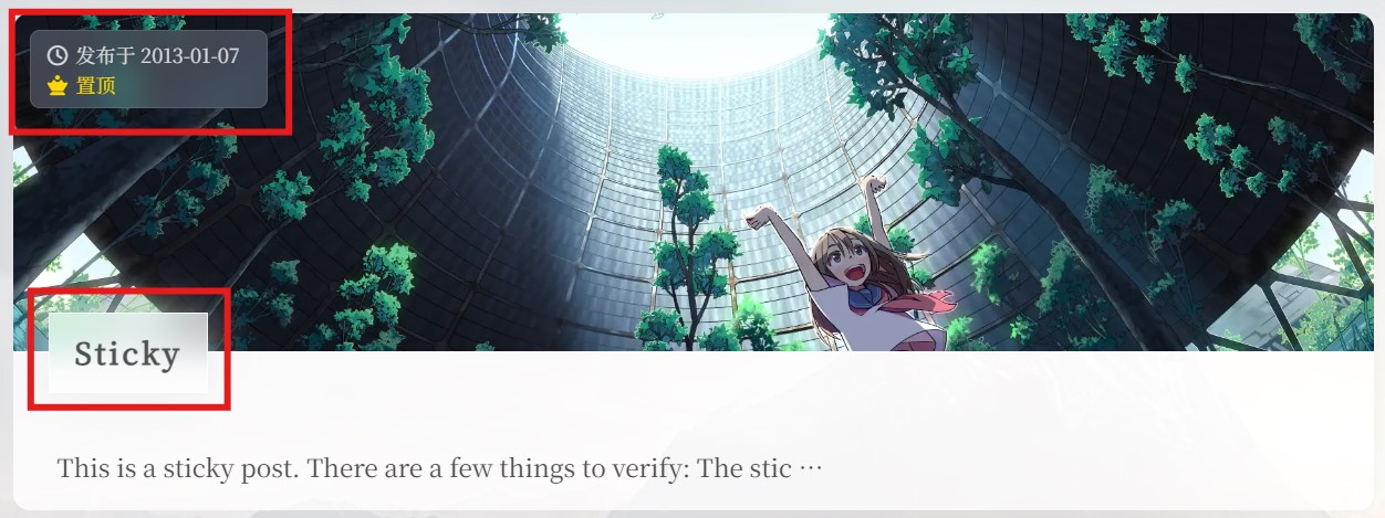
Top badges (date/sticky) and title both get rounded corners here.
Title Font Size
Set the font size for post titles (recommended: 16–20px).
Show “Shuoshuo” on Home
Enable displaying “shuoshuo” (short statuses) on the homepage. (Default: on)